Options (Fields)
Options are the core elements of the customizer feature, which allows users to customize their theme by picking the colors from the color palette, uploading a logo image, changing the font size and color etc...
Option Types
- Color picker (palette)
- Text field
- Text area
- File (upload and browser)
- Date
- Button
- Checkbox
- Radio
- URL
Here is a minimum customizer.json file example:
{
"colors": {
"title": "text_colors_title",
"description": "text_colors_description",
"control": {
"footer_background-color": {
"type": "color",
"label": "text_colors_footer_background_label",
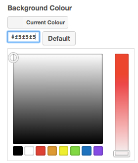
"default": "#f5f5f5",
"selector": "body"
},
"footer_color": {
"type": "color",
"label": "text_colors_footer_color_label",
"default": "#666",
"selector": "body"
}
}
}
In this example, all options are grouped under a group with the name colors. You can get more information about the Groups.
To register your options (fields) in the customizer file, you need to register them in a variable called control. In the above example, you can see 2 different options defined in the control variable.
One is the footer_background-color and the other one is the footer_color. As you can see, underscores and dashes used in the both example and there is a reason for that.
Name and CSS Property
The first part which comes before the underscore is the name of the option and the second part which comes after the underscore is the CSS property.
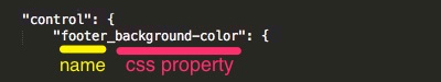
So, you can name your option and then put an underscore and type the CSS property you want, like background-color, color, background-image, font-weight, width, height...
Type
Then you need to register properties of this option. As you can see, the first property is the type. There are lots of option types you can choose from. You can see the complete list of the types from Arastta Form component's GitHub page. In the example we used color as the type, so in this option a color palette will be displayed to the user and users can choose their desired colors from the palette.
Label
This is the label of the option which is displayed to the users. You can hardcode the label or provide a string which is translatable.
Default
You can define a default value for your option, so users can undo or reset their customizations.
Selector
This is where you define the CSS Selector, so Customizer finds this selector in the DOM and apply the changes and customizations to that selector.